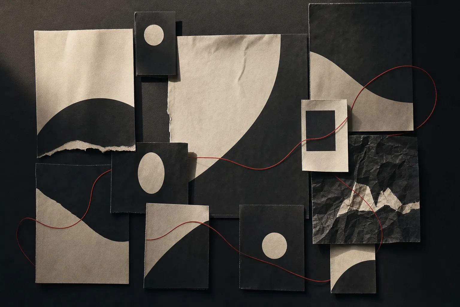

Campaign branding is what turns a good message into a recognisable body of work. It gives a campaign enough shared character that a person can move from a film to a social post, a store to a sales deck, and still feel the same idea at work.
That does not mean every asset should be dressed in the same costume. The point is to make the campaign coherent without making it repetitive. The best systems establish a few useful decisions, then give the work room to respond to context: a short video needs a different expression from a homepage, a retail sign or a customer email.
For teams, this is more than a design exercise. A clear campaign system makes it easier to decide what belongs, what does not and where to spend the next dollar. It helps partners move quickly without losing the point of view that made the work worth making in the first place.
Start with a campaign job, not a mood board
Before choosing a typeface, colour or visual device, name the shift the campaign needs to create. Is the job to make an unfamiliar service easier to understand? Reframe a decision that feels intimidating? Give a large organisation a more human voice? Create a reason to care about a new offer before the details arrive?
A campaign brand has to carry that job. If the business challenge is “people see us as interchangeable,” the system needs to make a distinct point of view memorable. If the challenge is “people do not understand what this means for them,” the system needs to make the value tangible and simple. The visual choices should support the shift, not substitute for it.
This is where defining the brand campaign pays off. A campaign is not a list of assets. It is a coordinated answer to a business problem, built around an idea the audience can recognise and carry with them.
Find the tension that gives the idea energy
People rarely need another polished statement of what a company sells. They need a message that meets a real hesitation, desire or contradiction in the moment they are making a choice. That underlying tension gives campaign branding its reason to exist.
Dove’s Campaign for Real Beauty is useful because the system was not built around a new product feature. It started from a wider disconnect between conventional beauty advertising and how many women saw themselves. Dove launched the campaign in 2004 using images of real women rather than standard advertising models, then continued to evolve the platform as the cultural context changed. The brand’s own history of Real Beauty makes that continuity clear.
The lesson is not that every campaign needs a large cultural mission. It is that the message needs a real source of friction. A strong campaign names something the audience recognises, then gives that recognition a fresh direction. Without that, a visual system may be attractive but has very little to hold together.

Build one central thought before writing the execution list
The central thought is the campaign’s operating system. It is not merely a headline, a design style or a three-word slogan. It is the simple idea that tells a team what the campaign is really saying, why it matters and how it should behave when the format changes.
Nike’s “Just Do It” remains a familiar example because it is broader than shoes, a single athlete or a particular sports season. Nike describes the line, introduced in 1988, as a call to begin and keep moving forward when the work is hard. That idea can show up through elite sport, ordinary effort, new generations of athletes and different products without abandoning its core meaning. The company’s “Why Do It?” campaign shows how a durable thought can be renewed rather than replaced.
When developing a campaign brand, write the thought in plain language first. A useful test is whether someone outside the creative team can explain it without repeating the exact slogan. If they can describe the emotional shift or point of view in their own words, the idea is likely sturdy enough to guide a system.
Then give the idea a message hierarchy. The strongest campaign systems make the main thought easy to recognize while leaving room for proof, product details and calls to action. The guide to campaign messaging explains how to keep those layers clear when the work moves between formats.
Decide what must stay fixed and what can change
Consistency is often mistaken for sameness. That is how campaigns end up with one layout copied across every channel, even when the audience is seeing it in completely different conditions. A better system separates the non-negotiables from the flexible parts.
The fixed parts might include the core message, the campaign’s emotional temperature, a visual gesture, a storytelling rhythm, an image treatment or a way of framing the audience. The flexible parts may include the format, length, product emphasis, supporting proof, cast, location or call to action. The exact mix changes with the work, but the distinction should be clear before production begins.
Apple’s long-running Shot on iPhone platform shows the value of a simple rule set. The subject matter and individual images can vary radically, but the campaign repeatedly makes the product promise visible through the work people create with it. The system does not need to explain itself in every frame because the organising thought is already doing that work.
Give the system a real-world stress test
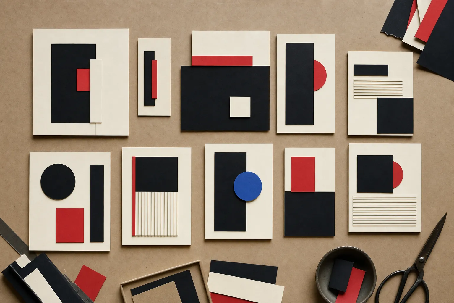
A campaign brand is not ready because the hero visual looks good in a presentation. It is ready when the idea can survive the places where people will actually meet it. Test the system early in a few deliberately different situations: a short paid placement, a longer film, a small mobile screen, a retail or event moment, an email subject line, a sales tool or a customer-support message.
Ask the same questions each time. Does this still feel like the same campaign? Is the message clear at the speed the audience will give it? What is doing the recognition work: the idea, a useful pattern, a repeated point of view, or only the logo? Does the execution earn attention while still making the next step obvious?
The test is especially important in regulated, high-consideration or complex categories. The campaign has to make room for necessary information without becoming a brochure. That calls for a system with enough personality to be recognised and enough discipline to remain clear when the message carries real consequences.
Use the system to connect customer moments
Campaign branding is strongest when it follows the customer rather than the media plan. People do not experience a brand in the order a team built the asset list. They might hear a recommendation, see a short video, compare options on a website, walk past a store display and only then decide whether to act. The campaign should make those moments feel related, even when their jobs are different.
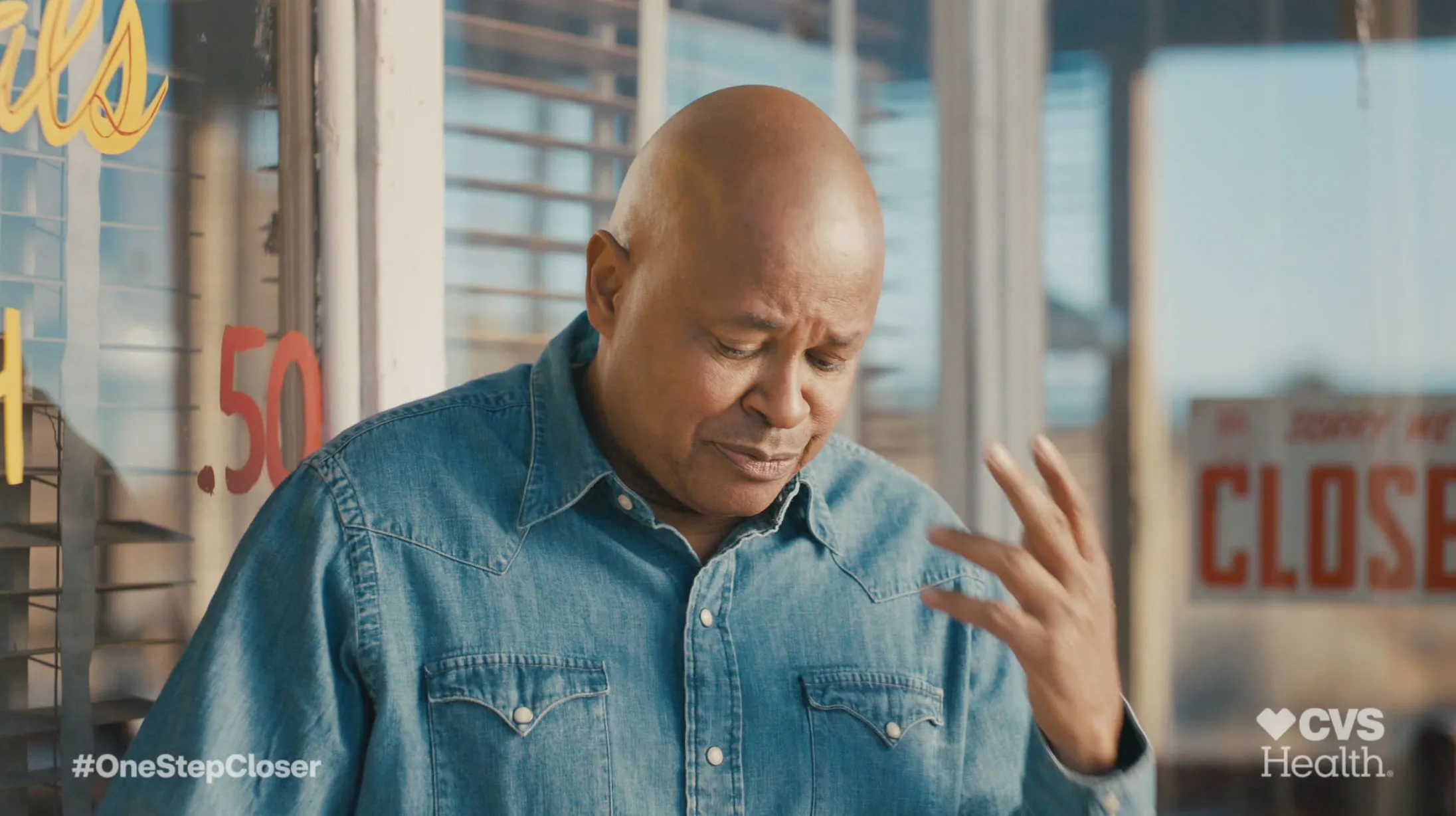
Chad’s #OneStepCloser work for CVS Health is a clear example of this approach. The platform connected a practical health decision to the ordinary moments people wanted to return to. That emotional idea gave broadcast, digital, in-store and social work a shared human centre, while each channel could still do its own job.
For a smaller organisation, the same principle can begin with fewer touchpoints: a launch page, a customer email, a sales story and a focused social series. The scale is less important than the connection. The campaign should give each piece a reason to exist and a recognisable way to belong.
Make production decisions easier, not more ceremonial
A campaign guide is useful when it helps people make better choices under pressure. It should not become a thick document that only the original team can interpret. The practical version may be a compact set of principles: the central thought, who it is for, what to emphasise, the visual and verbal cues that carry recognition, examples of how the system flexes and a short list of things that would break the idea.
This is also where creative direction becomes operational. Someone needs to protect the level of the work while helping teams make sensible trade-offs. A faster execution may need to simplify. A new market may need a more local expression. A product launch may need more proof. The system gives those decisions a shared basis rather than treating each request as a fresh debate.
Put those decisions into the working brief before production starts. A useful campaign creative brief gives the team the business decision, audience tension, central thought and practical boundaries that keep a campaign system from becoming a collection of disconnected assets.
Signs the campaign brand is not doing enough
- Every channel needs a separate concept. The work may share a logo, but it does not share an idea.
- The visual style overwhelms the message. People remember the treatment but cannot say what the campaign stands for.
- Only the hero asset feels distinctive. The smaller, more frequent customer moments could belong to almost any brand.
- The rules are too rigid to be useful. Teams copy a layout instead of adapting a point of view.
- The work gets refreshed before it becomes familiar. Internal fatigue is mistaken for audience fatigue.
How Chad helps turn a campaign into a working system
Chad works with organisations that need the strategic idea and the creative expression to arrive together. His experience spans brand strategy, integrated campaigns, retail experience and healthcare communication, with particular attention to the moments where a big idea has to become usable across teams and channels.
That can mean clarifying the campaign platform, setting the creative direction, building the first system of work or helping a team decide which expressions matter most. The aim is not a prettier toolkit. It is a campaign brand that gives people a clear reason to care and gives the business a clearer signal in the market. For a conversation about a launch, a reset or an idea that needs to travel, talk with Chad.
Frequently Asked Questions
Campaign branding questions, answered.
What is campaign branding?
Campaign branding is the set of ideas, messages, visual cues and creative rules that make a campaign recognisable as one connected expression. It gives different pieces of work a shared point of view without forcing every ad, film, post or experience to look identical.
How is campaign branding different from a visual identity?
A visual identity is the long-term language of the organisation: its logo, typography, colour, imagery and core brand assets. Campaign branding is a focused layer built for a particular business moment. It should use the parent brand well while giving the campaign its own energy and way of moving.
Does every campaign need a new logo or tagline?
No. A campaign needs a clear organising idea, not necessarily a new mark or line. New assets earn their place only when they help people recognise the campaign, carry a useful message or make execution easier across the places the audience will encounter it.
How do you know whether a campaign system is strong enough?
Test it in more than one context. If the idea still feels like itself in a short social post, a customer email, a retail moment and a longer film, it has enough structure. If every new format needs a fresh concept, the system is too dependent on a single execution.